As you can see I sorted out the white and red colour scheme and tried my best to balance the colours out. I'm pretty happy with the dashed of red in the design on the columns and the top. The dome at the top adds a point of interest when you go up the tower and I'm thinking of adding windows at the top to show off the texturing because I spent a long time fixing that window up in photoshop to fit the colour scheme.
Here I added some nice detailing of red ivy climbing up one of the towers which I'm wanting to put a spiral staircase down. again showing off the textures and creating more interest within my area. I was thinking about adding more ivy around the castle but I didn't want to go too overboard because the trees are already quite vibrant and decorative.
Here I decided to add a bridge to my castle because what's a castle without the good old classic bridge? then again I don't have a moat around but I still wanted a bridge. As you can see I did a arched bridge to begin with but it looked so out of place although it looked pretty good close up where you'd be able to walk under. So, I decided to make a basic bridge and put the posts all the way across to give my game space a sense of continuity.
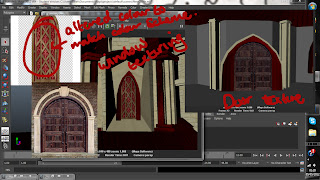
Here are the textures I used for the window and the door. The door actually looks pretty good close up but with the brief beging scenography I built the bridge so you can get a better look at the castle as a whole and appreciate your surroundings a bit more.


No comments:
Post a Comment