
This blog will project my ideas, thinking processes and show the development of my work over the next three years of my course.
Tuesday, January 31, 2012
Twoet
This is a really beautiful yet sad animation made by 'GreenCream' that I came across by accident. When I saw the use of silhouettes I was immediately intrigued because we've done the same for our Norse Mythology based project.
I really like this piece because as well as looking really nice, the effects over the silhouettes and the sound effects really add that wow factor. I think making our own sound effects and such might be something to consider for our animation. I think it'd really personalise it and because of the style it's presented in I think it might work well.
The story to this animation is also really moving, and I think a good story can really help make something come to life. This one really reflects the damage that human activity has on wildlife and the environment. It's a very powerful subject matter to cover but I still think it's a very beautiful animation despite that.


Background Images
These are the three background images I came up with, in relation to the storyboard and some reference images we gathered as examples of the settings we wanted.

This picture took me quite a while because I really struggle with perspective. I also made a lot of mistakes which were pointed out to me by my sister regarding the damaged parts of the building. However, I'm quite pleased with the outcome, I think the greyscale makes the picture quite moody, mysterious and quite the stand alone piece. I think it's a fitting image for the opening of our film piece.

I don't like this picture very much because it's so flat and lacks perspective so next to my other drawing it doesn't look good at all. I think there's a lot of room for improvement on this picture but because of time constraints I'm going to leave it as it is unless I find some time at the end to do it.


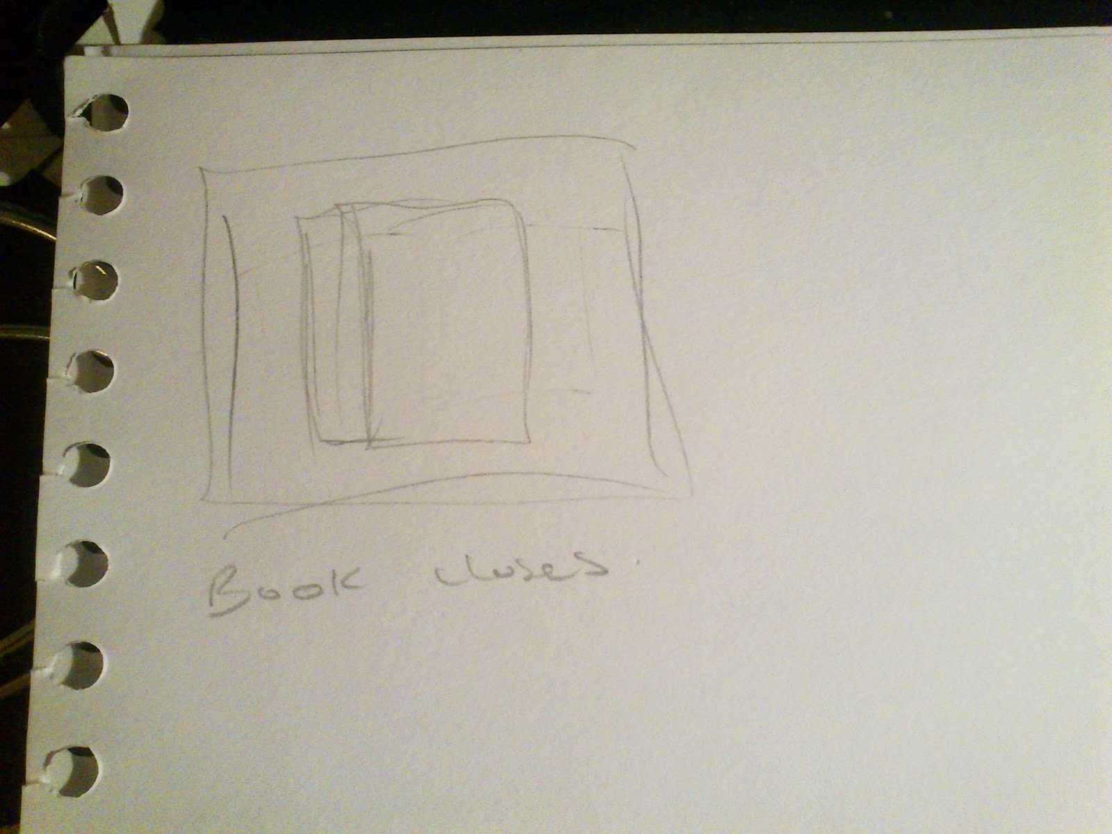
For the third picture, there was going to be a part where he opens the book so in essence the background would be of the floor because h's looking down. So for this picture I decided to have a mess around on Photoshop with a stock photo of a kind of pavement texture.
These are the reference pictures.

I split these images between myself, Jess and Finn. To make it fair, I let everyone choose the column they wanted to reference from and by doing this I wouldn't be giving people tasks they didn't feel they could do.

This picture took me quite a while because I really struggle with perspective. I also made a lot of mistakes which were pointed out to me by my sister regarding the damaged parts of the building. However, I'm quite pleased with the outcome, I think the greyscale makes the picture quite moody, mysterious and quite the stand alone piece. I think it's a fitting image for the opening of our film piece.

I don't like this picture very much because it's so flat and lacks perspective so next to my other drawing it doesn't look good at all. I think there's a lot of room for improvement on this picture but because of time constraints I'm going to leave it as it is unless I find some time at the end to do it.


For the third picture, there was going to be a part where he opens the book so in essence the background would be of the floor because h's looking down. So for this picture I decided to have a mess around on Photoshop with a stock photo of a kind of pavement texture.
These are the reference pictures.

I split these images between myself, Jess and Finn. To make it fair, I let everyone choose the column they wanted to reference from and by doing this I wouldn't be giving people tasks they didn't feel they could do.
Monday, January 30, 2012
Drawing with black and White
I found a really good website that's similar to sites like iScribble and has a artist community. This website has a gallery that focuses on drawing in black and white. I found this really interesting and helpful because it's nice to see what different techniques that people use when drawing with these colours. It's also completely relevant towards my animation piece because i'm designing some of the backgrounds.
Here's the link: RateMyDrawings
Here's the link: RateMyDrawings
Sunday, January 29, 2012


Friday, January 20, 2012
Animatic
This is the animatic for my animation.
As you can probably tell this animatic follows a different story to that of my storyboard. Prior to one of my presentations, I was told that animating the end would be quite difficult so I decided to come up with a completely new idea.
The story is now to do with a race between big and little. The big Pommie falls over half way through and the little one overtakes and wins. Simple.
The reason I decided to change to this idea is because, after getting feedback on my own presentation and looking at my peers storyboard's I thought that maybe the storyline was more prominent than the actual animating. A race seemed to be a good way of demonstrating my understanding of the principles of animation because I could focus more on the movement of my character.
The animatic also has some of the shots that i'm going to be using for my animation now prior to my previous post on the drag race.
Camera Reference
This is the video I referenced when trying to get a feel for the kind of shots used in races. I just went onto Youtube and this was the first thing I found.
I would definitely say that the kind of shots used in race footage is very different to say a stroll in the park because there's a lot of build up and I want to use this to my advantage and demonstrate my understanding of anticipation in animation.
I never would have thought of some of the shots used in this footage, like following from behind and the overhead shots, so I'm going to try and incorporate some of these things in my animation. This video will have a lot of influence on my animation.
Tuesday, January 10, 2012
Filming Project
Towards the end of November, we were given our next brief which is to do with film. Inspired by the Stansa Stones project, young writers have been attending workshops executed by Simon Armitage himself and have started to create their own poems. Within this film project, we will be taking some poems from these young writers and creating a 2 minute piece of either film or animation.
Before he holidays we gathered our ideas and made this mood board together but since then our idea has changed.

We're sticking to our original storyboard and have taken on the idea of using static images with silhouettes over the top. The background images have been split up into sections and will be done by myself, Jess and Finn while the characters and silhouettes will be done by Robyn. The static images are going to be done on digitially on A3 in greyscale but this may change because we're wanting to experiment with colour too.
Before he holidays we gathered our ideas and made this mood board together but since then our idea has changed.

After a very wobbly start, my group has finally come together and discussed the new plan in light of the lack of progress made during the Christmas Holidays. After simplifying the initial idea we've decided to create an animation inspired by the opening of the game Okami and ultimately, the idea of using shadows/silhouettes which was one of two contingency plans.
For those of you who haven't seen the opening, here it is, enjoy :)
We're sticking to our original storyboard and have taken on the idea of using static images with silhouettes over the top. The background images have been split up into sections and will be done by myself, Jess and Finn while the characters and silhouettes will be done by Robyn. The static images are going to be done on digitially on A3 in greyscale but this may change because we're wanting to experiment with colour too.
Modeling
I had a pretty slow start with modelling cos I found it quite hard to understand so I did a lot of tutorials and work at home and I eventually got there.
The first thing I started modelling was the apple on my character, Pommie's head. I started with the basic shape and then worked into it using the edge loop tool and your standard resizing and moving tools (W,R).


To finish the apple off I just added a hypershade using the blinn because it's nice and shiny and of course a nice deep red colour.


For the body and the eyes, I needed to get around how to do UV mapping. I first saved a JPEG image of the nets for each body shape. Because they're all sphere's it wasn't too complicated. I then moved onto creating an image in Photoshop which I would then put back into Maya, assign to a new hypershade. I used Lambert for all the body parts. And as you can see if you compare the images above, I changed the number of times this pattern is repeated to get a nice even amount of spots in reference to my model.

I found it pretty hard to model the eyes funnily enough. Even though I drew circles for the pupils, every time I applied it to my model the image I drew would stretch across and his eyes ended up being oval shaped instead of circular. It doesn't look so bad for the 'happy eyes' of course cos they're arc shapes anyway. Knowing this, I then tried using a vertical oval thinking it would stretch out into a circle. No. It didn't work. So in the end I managed to get it where it wasn't so noticeable and looked half decent.

This is my finished model. I'm really happy with how it turned out because it looks strikingly similar to the model and of course, I couldn't really ask for anything more.
The apple is actually my favourite part of my character's model because it kinda symbolises my turning point and I also put a lot of time and effort into making it despite it's such a small part of the model as a whole.
Thursday, January 5, 2012
Storyboard
For my storyboard I decided to go for a nice, happy-go-lucky storyline.


Basically, Little Pommie is having a nice stroll in the park and the big Pommie comes along and knocks the apple from his head. Little Pommie then chases the apple down the path until it hits a rock and comes to a stop. Little Pommie then does a sigh of relief and puts the apple back in it's rightful place.


Storyboard
This is our storyboard for our first film.


The storyboard was done by Jess who was assigned as our storyboard artist. I take responsibility for her confusion in the beginning because I don't think I was clear enough about what it was I wanted based on the group discussion a while back. So, I sent her a rough storyboard to help her out and she a better version and altered a few things.
This storyboard is the rough version I sent her.


I came up with the basic story by referencing some Old Norse tales and combining everyone's ideas such as the story telling with the book and included things that would work with the social connections based on what certain members of the group shared with me.
Tuesday, January 3, 2012
BLU
These are some videos I found which show a really nice blend of stop motion and graffiti.
Watch and enjoy~
All these wonderful pieces of stop motion graffiti are made by an artist called BLU. This artist's work is absolutely amazing. The amount of time and effort that goes into his work is insane. I like that throughout his work he always seems to use white paint. It's makes his work very distinct and is almost like a signature of sorts.
I also admire that he's put together blend of both animation and graffiti. I think it really helps us to perceive this art style in a different way and I think with the likes of other well known graffiti artists like Banksy, that graffiti is now more appreciated as an art form.
Monday, January 2, 2012
Taking Notes
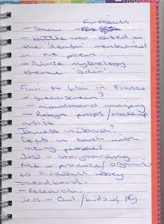
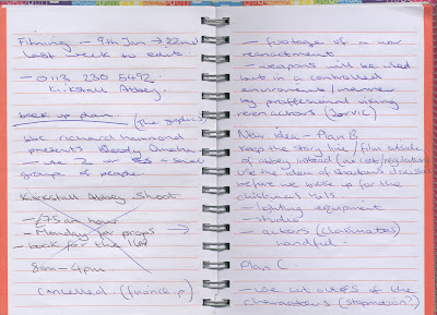
During this module i've been taking notes of several events and writing down the changes to the film project where needed.


At the beginning of this project I was actually with a different group of people but because of some people being absent our group became quite big so we split into two different groups, still keeping the same span of ideas.
These are the ideas I noted down before changing groups.

After the switch in groups I then noted down stuff relevant to the idea we picked and the things that we needed to do.

I had also jotted down a few contingency plans incase things didn't go well. It was a good thing too because things actually didn't pan our the way we wanted them to in the end but rather than doing a stop motion we actually went down the route of animation.

As our plans started to fall apart, I found the best platform to get in touch with people was through Facebook. It did take some time for certain people to get back to me but I had no response via email unless it involved sending work to each other.


Sunday, January 1, 2012
Choosing a model
Okay so Now I move onto the modelling. Firstly, I had to take photos of my little character so create some image planes in which I can then model from.


I decided to choose this little toy because as well as being made out of basic shapes, namely spheres, he also looks like he has a lot of character which would be great for me to use to my advantage when animating his movement.
These are the photos I used. It's basically just a turnaround of a character but using photographs.


I decided to choose this little toy because as well as being made out of basic shapes, namely spheres, he also looks like he has a lot of character which would be great for me to use to my advantage when animating his movement.
Subscribe to:
Comments (Atom)